Monday, December 29, 2014

Concentration III : The Conjoined Twins - Construction


Before I start, let me just say... what. a. doozie. The process of sculpting these conjoined twins was probably one of the most stressful and time consuming of all the others I've made thus far. I think the problem was that I knew the effect that I wanted to make with the piece but I didn't know how to execute it. I knew I wanted to sculpt circus-y conjoined twins that were conjoined in an asymmetric, reimagined way but I didn't know exactly how they would look. All I really had figured out was the color scheme which only comes into play later. I also wanted one of the twins to seem sad and the other to seem more menacing and parasitic. Here are the many progress pictures and false starts that led, somehow, to the final product.


What.


Ew.


After these three false starts, I enlisted the help of a local model....


Drop dead gorgeous.


 So as you can see, I was making no progress with this weird parasite twin idea.


So OFF WITH ONE OF THEIR HEADS and on with a different plan.


.... and an even worse one at that. 


And then I finally found a happy medium between the two ideas and I magically learned how to sculpt again with the help of trusty Youtube videos. 


And then I finally started having fun again, adding my own Tim Burton inspired touches and challenging myself with sculpting teeth and strangely morphed lips and eyes.


And then I went crazy with the finishing touches adding a fun bow-tie, epaulets, and ruffles.

After weeks of confusion, indecision, and frustration, meet.... 

Phil and Lip, your favorite pair of conjoined twins! 


Breadth III : Multiples and Modules - Construction


This project really threw me off at first because I couldn't quite wrap my mind around modular art. To add onto this distress, I was extremely hard headed and I became infatuated with the idea that my medium would be thumbtacks. So here I was, trying to come up with some way to make a sculpture out of these pointy, transparent objects. Luckily, I found inspiration in the work of Jennifer Maestre, about whom I wrote a post a while back. Although I didn't use her medium or technique to create this sculpture, looking at her body of work greatly helped me come up with an idea for my own piece. 


I also took inspiration from Byzantine mosaics with their beautifully symmetric floral patterns and geometric tendencies. 


To be honest, I just started gluing things together to see what would happen and then my inspiration guided me the rest of the way. I began with the little tower shown above and using it as my center, I stuck it on a piece of cardboard and outlined the rest of the sculpture on it. I then had the proper guidelines to help me put all the thumbtacks in the right place. 


This process was rather punishing due to the prickly, blood-drawing medium and the hot, burn- inducing tools. 


The final piece resulted in a chandelier-like sculpture that refracted light in a rather beautiful way but failed due to its meager size and poor construction. This is probably the most non climactic of my pieces probably because I didn't really have an image in my head during its construction and it showed in the final product. I still think it has some interesting visual elements and that it'll photograph well. I might add to the piece by orienting it on a circular mirror to take advantage of the one thing that it has got going for it (previously stated). 


Concentration I : The Fortune Teller - Glazing Process


This glazing process has been taking much longer than intended due to my general indecisiveness on the color scheme and lack of knowledge of techniques in mixing authentic looking dark skin. It turns out that making pale-skin glaze is much easier than making dark-skin glaze, especially the sort of burnt tan color that I am going for for this piece.


I began the process by mixing a dark reddish-brown and applying it so that it fit into the crevices of the clay and then wiping away the excess with a watered sponge. 


Pre-Glazing Plans: I will be using this technique for each layer of glaze that I apply, each being lighter than the previous one and then I will go in with some undertones and highlights to finish off the skin. I'm also going to add funky eyeliner and eyebrow makeup as well as settle for a nice lip color and then have some fun with glazing her headscarf. I think I'm going to keep her blouse white and maybe add some watered down grays and black to add depth to the "fabric." I also plan on making her hair a dark brown and making her eyes a glazed over light blue color to give off the sense that she is having a vision. The overall color scheme is turquoise with gold details and brown skin and dark hair. 

UPDATE: The following are photos of the final steps of the glazing process. Enjoy! (03/01/15)


I then painted her eyes in more so they look like they are being rolled to the back of her head as if she were telling a fortune. It's quite creepy but I still think she is beautiful with her unique hair and makeup. 


She is now in the kiln ready to be fired! I put clear glaze over her eyes and mouth to give them a glossy feel and that is why they look slightly green in the above photos. 

AND FINALLY (drumroll please)...... THE FORTUNE TELLER!!


Concentration II : The Strongman - Glazing Process

Despite being my second concentration piece, The Strong Man ended up being the first to be completed due to its simpler design and color palette. 


A few things were clear from the get-go: I wanted him to be pale and I wanted him to have a leopard unitard. After spending what seemed like a million years trying to mix the perfect color for the orange in the leopard print, I enlisted the help of my teacher because I was getting NO WHERE. She taught me some techniques to mixing glazes and I feel a lot more comfortable doing it now.


I then proceeded to filling in the rest of his features and coloring in his eyes in as detailed a manner as possible.


I wanted him to be pale although he seemed textureless with the glaze I had mixed. To add depth to his skin, I added some pink undertones on his nose, cheeks, forehead, ears, and chin; layered over the pale glaze, then added watered down brown-black glaze to fill into the tiny undulations that I hadn't smoothed over before.


Finally, I added some clear glaze on some of his more prominent features to make him look squeaky clean and polished like a good strong man should!


Saturday, November 1, 2014

Breadth III : Multiples and Modules - Artist Inspiration ~ Jennifer Maestre

Our next breadth assignment is titled "Multiples and Modules" because we have the option of creating a sculpture using multiples of a distinct object to form another object or creating an interesting form out of modules (toothpicks, marbles, dice, pencils, etc.)

After receiving the assignment I was rather perplexed as to what I was going to do and whether I would want to use multiples or modules. So I set out to find some inspiration in the artists that employ this art form as their specialty.

In my search, I came across a spectacular talent by the name of Jennifer Maestre!

Maestre is an artist who is known for these amazing modular sculptures inspired originally by the texture and shape of a sea urchin.


She has come up with a very creative process of cutting pencils into one-inch strips, drilling holes into them to make them into a sort of bead, and then sharpening them. She sows them together using the peyote stitch, resulting in some absolutely lovely and colorful organic forms.


The variety in her pencil colors makes her pieces visually breathtaking and the quality of her work is top-notch. I never thought someone could create such an accurate 3D portrait of me but I was proven wrong by this spot-on sculpture of my face pictured on the right.


This is probably my favorite piece by her and also the inspiration for my own modular project!


Check out her website to see even more amazing pencil sculptures. While you're at it, make sure to look up some of her older, nail sculptures; they're super cool as well!

Concentration II : The Strongman - Construction

During the process of creating this piece, I was finally able to narrow down my concentration: Freak Show Performers. I notice in hindsight that this might have been inspired by many of my friends fan-girling over American Horror Story but I hope to interpret these characters very differently and come up with my own version of classic acts first made popular in 16th century England.

For this concentration, I decided to create a male character based off the "strong man" act that was known for his signature facial hair and for lifting heavy objects or humans in front of a live audience.


I really wanted my strong man to be holding a toothpick in his mouth so the first obvious thing to do was use one of my classmates, Peter, as a model.


I then create my two pinch pots, attached them, added dents for the eye sockets and added a mustache, nose, chin, and lower lip.


I also took a giant lump of clay and shaped it into a preliminary shoulder and chest form.


I added eyes and eyelids and refined some of the structural details of my character's face.


I soon noticed how unnatural he looked with his mouth closed like that so I had to rip off that pretty little mustache and sculpt a more toothy mouth.

First order of business: find the perfect model:

MYSELF!


Do you see a resemblance? Because I sure do! And yes, I am a part-time model, thank you for asking.
After not capturing the absolute perfect expression for my Strong Man because I cannot model for my life, I set on a quest to sculpt the expression I wanted with a more test and check approach.

Exhibit A:

                  Uh.... no.


Exhibit B:

                                  Closer but still no.

I decided to move on to another part of the sculpting process and come back to Strong Man's face later because I was going no where at that point.

So I skipped over to my favorite part: REMOVING THE INNARDS!


Teeheeee you can see his nose holes 


Being the genius that I am, I thinned out too much around his eye ONCE AGAIN (yes, I have done this once before) and I don't know if you can see by the picture above, but I had to patch up his eye and re-sculpt it. 


I then reattached his scalp and moved on to plopping his head onto a neck and then onto a chest. 


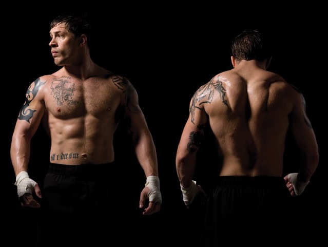
I proceeded to adding some muscles and had to unfortunately use reference photos of really ugly men (it is really hard to write sarcastically but what I in fact am being sarcastic; these reference photos made my day, Tom Hardy is beautiful and has mad trapz that should be worshipped)


My teacher also gave me a heads up (pun intended) when she noticed that my sculpture's face was pointed up in an unnatural angle. 


He looks quite scrawny in the above photo but I eventually added almost another head length of clay to his shoulders and refined his muscles. 


I also added ears to top off his main anatomy.


As you can see, I broadened his shoulders and added his one-strap costume.


And with this large amount of added clay, comes the need to...

REMOVE THE INNARDS!! MWAHAHAHAHAHAH


The result was a very large amount of scrap clay and a satisfaction that is very concerning to have had after carving out the insides of a fake person. I should probably talk to someone about that.....
ANYWAY

I used water and some paintbrushes to smooth out the surfaces of his skin and finalize any rough edges.

I also used some texture tools to add the fur effect to his singlet!


And here he is! Say hello to Strong Man!